By familiarizing yourself with the navigation panel, top navigation, report download options, help resources, and dynamic filters, you can efficiently navigate the Looker Studio Dashboard. Each of these tools is designed to make it easier for you to dive into the data, tailor reports to your needs, and gain actionable insights to inform your website strategy.
Learn the General Navigation
View the video instructions on how to navigate in your Looker Studio Dashboard:
Accessing & Sharing the Dashboard
To access your College or Unit’s analytics dashboard, follow these steps:
- Paste the Looker Studio link (provided by UCM) into your browser, or visit lookerstudio.google.com and, under the "shared with me" section, click to view your dashboard.
- Log in using your OHIO email address and password.
- If you encounter any issues accessing your unit or college’s dashboard, submit a request for assistance through the UCM Request Form under the "Web" section > "Google Analytics".
- If you're unsure whether your unit has an analytics dashboard, please submit the UCM Request Form .
Navigation Panel: Accessing Different Report Pages
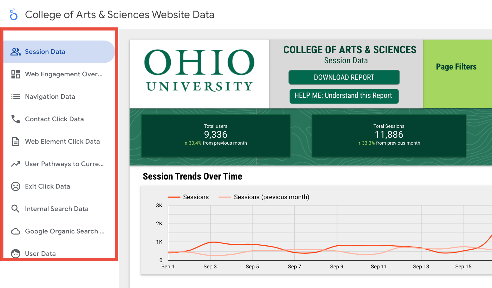
At the top left of the dashboard, you’ll find the name of your dashboard for easy reference. Just below that, on the left-hand side, is a navigation panel. This panel contains all the report pages, each one focusing on a different aspect of the data. The active report pages include:

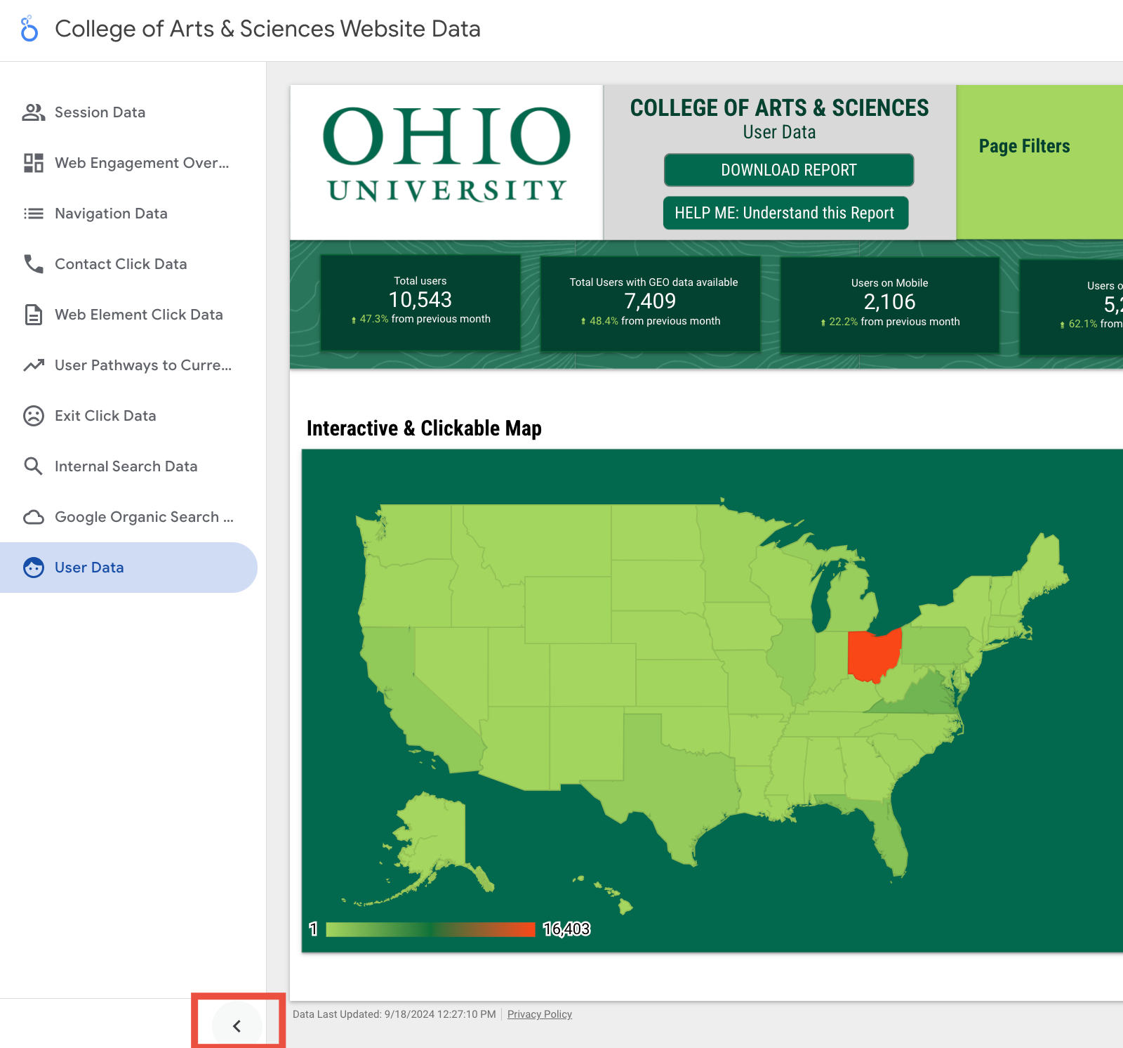
You can switch between these pages easily by clicking on the one you want to view. If you’d like to see more of the report page without the panel in the way, simply click the carrot icon at the bottom of the panel to collapse it. This expands the current report page to full screen, giving you a clearer view of the data.

Top Navigation: Key Information at a Glance
In the top navigation, moving from left to right, you’ll first see the Ohio University logo. Next to the logo is the name of the college or unit related to the dashboard. Just beneath this, you’ll see the report page name. This will update depending on the report page you’ve selected from the left-hand navigation panel, allowing you to keep track of what data you’re looking at.
Downloading Reports: Full or Selective Pages
Directly below the report page name, you’ll find two important buttons:
‘Download Report’ Button:
Clicking this lets you download the entire dashboard. If you want all the report pages, simply choose ‘All pages’ and hit download. This will save the dashboard as a PDF for easy sharing or offline viewing.
If you only need specific pages, select ‘Select pages,’ check the boxes next to the pages you want, and download them as a PDF. This is useful if you’re only focusing on certain aspects of the data.
‘HELP ME: Understand this Report’ Button:
Clicking this will take you to a dedicated training page at https://www.ohio.edu/ucm/training/analytics . This page provides in-depth explanations on how to use each report page effectively. It also outlines the kinds of insights you can gain, helping your team make better, data-driven decisions about your web content.
Page Filters: Tailoring Data to Your Needs
One of the most dynamic features of the dashboard is the set of page filters, found in the moss green section of the navigation bar. These filters allow you to tailor the data you see on each page based on specific criteria, such as the page path, session source, or date range. It’s important to note that these filters change from page to page.
For instance, on the Session Data report page, you’ll have filters like Page Path, Page Path Group, Session Source/Medium, and the Date Range Filter. However, if you switch to the Internal Search Data page, you’ll find different filters such as Page Path, Department Site Selector, Internal Search Query, and Date Range Filter.
Once you make a selection from these filters, the data on the report page will automatically update to reflect your choices. Keep in mind that these filters are specific to each report page. They don’t carry over across the entire dashboard, so you’ll need to adjust them each time you switch pages. Despite the differences in filters from page to page, every report page includes this feature for customizing the data view.
-
Start Exploring Your Looker Studio Dashboard
To dive into your Looker Studio dashboard, explore real-time insights that reveal how your content is performing. Analyze key metrics like web traffic, engagement, and conversions, empowering you to make data-driven decisions that enhance your digital strategy.
Examples of How Data can be Actionable
Here’s how they can use your dashboard data to improve content and user engagement, without needing technical expertise. We recommend using specific pages from the report to dive deeper for more detailed insights.
Focus on Popular Pages
- What to do: Look at the pages with the most sessions (i.e., visitors). These are the most popular or high-traffic pages, indicating user interest.
- Action: Keep these pages fresh and relevant. Update information, add new content (like articles or videos), and ensure everything is easy to read and navigate. Since users are already visiting these pages, make sure they’re as helpful and engaging as possible.
- Dive Deeper: Use the User Pathways to Current Page report to track how users move between these popular pages. This can help identify common paths users take and whether certain content leads to more interactions on other pages.
Look for Pages with High Engagement Rates
- What to do:Pages with high engagement (above 70%) mean visitors are interacting with the content or spending time on the page.
- Action:Try to understand what’s working on these pages (e.g., clear writing, appealing visuals, useful links). Use similar strategies on other pages that might have lower engagement.
- Dive Deeper:The Web Engagement Overview Report offers insights into which pages or elements are receiving the most interaction. This can reveal additional areas that are contributing to high engagement and might need more focus.
Use Time on Page to Improve Content
- What to do: Pages with low average time (e.g., less 20 seconds) might not be keeping visitors interested, or they’re too short.
- Action: Add more details, visuals, or related links. For example, if you have a page about a degree program, add testimonials or student success stories to keep people engaged longer.
- Dive Deeper:Check the Exit Click Data to see where users are leaving the page or site. If a high percentage of users exit from these low-time pages, consider revisiting their content structure to keep visitors longer.
Understand Where Your Visitors Come From
- What to do:The "Distribution of Sessions by Source/Medium" shows how visitors found the site (e.g., Google search, direct traffic, email). If most visitors come from search engines or direct visits, this means they are specifically looking for your content.
- Action: Keep content relevant and easy to understand. If many visitors come through search engines, make sure page titles and descriptions match what people are looking for (this doesn’t require SEO expertise, just clear writing).
- Dive Deeper:Use the Google Organic Search Report to further analyze the keywords or search terms driving organic traffic. This helps you refine your content to better align with what users are searching for.
Prioritize Pages with Traffic Growth
- What to do:Look for pages where traffic (sessions) has increased a lot recently. This might mean that the topic is becoming more relevant or popular.
- Action:Focus on improving and expanding these pages. Since more visitors are showing interest, adding new content, resources, or updates can keep them engaged.
- Dive Deeper:This Session Data Page Report can help you understand how users are arriving at these growing pages. By seeing the sequence of steps users take to get to these pages, you can better optimize their journey.
Review Low-Engagement Pages
- What to do: If some pages have low engagement rates (e.g., below 70%), visitors may not find the content useful or interactive.
- Action:Check if the information is outdated or unclear. Improve the structure by adding subheadings, visuals, or interactive elements to make the page more engaging.
- Dive Deeper:Use the Web Element Click Data Report to see if certain buttons, links, or interactive elements on these low-engagement pages aren’t being used effectively. This can help you redesign or reposition key elements to encourage more interaction.
Compare Time Periods to Spot Trends
- What to do: Look at session trends over time to understand when traffic increases or decreases. This can help you learn what content is more popular during certain times (e.g., around application deadlines).
- Action:Update content before peak times (like semester starts or application windows) to ensure that visitors find relevant and timely information.
- Dive Deeper:The Internal Search Data Report can reveal what users are searching for during these peak times. This helps you stay ahead by providing the most in-demand content before they start searching for it.
-
You still need help?
You're not alone in this! Schedule a personalized 1:1 consultation with UCM to get your specific questions answered and gain expert guidance. We'll help you and your team unlock the full potential of your data, making it easier to drive actionable improvements for your webpages and achieve meaningful results. Click the project request form below and navigate to Web < Web Analytics/Dashboard Support Request.
